Enkele alinea's uit artikels over dual navigation models toegepast bij iPadmagazines:
MULTIPLE NAVIGATION SCHEMES (bron: Nielsen Company)
One final word about navigation in magazines: Most magazine apps today seem to have settled for a dual navigation model: swipe to get to the next article, scroll vertically to read
This model takes users some time to discover, but overall it seems not to cause major hurdles, as long as the application uses it consistently.
Problems arise when the application imposes a navigation scheme most of the time, only to violate it occasionally.
In the section on orientation (page 72), we saw examples of inconsistency in navigation across orientations. Sometimes, however, apps use different navigation schemes depending on the article. One frequent culprit is the slideshow article (see the example below from Time): for this type of article, apps often choose to depart from their regular two-dimensional navigation and instead go for horizontal navigation.
Time magazine. Slideshow (as well as a few other articles) violated the normal dual navigation scheme of the magazine. Users tried to scroll down to see more pictures and took some time to figure out that they needed to scroll horizontally.
In conclusion:
Do not use multiple navigation schemes in the same app (in different •orientations or in one orientation).
Do not use horizontal navigation for your slideshow if your app supports a two-•dimensional navigation scheme elsewhere.
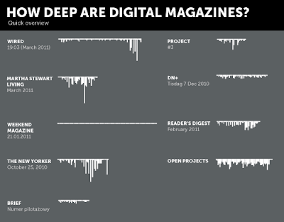
HOW DEEP ARE DIGITAL MAGAZINES?
In classical printed magazines the navigation scheme is pure one-dimensional: all pages follow each other on the right (or left, depening in wich language you read magazines). Many digital publications break this by folding following pages on the same topic down: let the reader literally dive into a topic.
This easy two-dimensional scheme gives editorial designers a new way to display content. We analyzed 9 different digital magazines on how they use the deeper level by stacking pages to each other like bricks.
Of course, this structure is not entirely visible to the reader/user who only sees the current page he is reading. But some things are recognizable, like “gaps” as 1-page-advertisements between very long articles.
And there is a third dimension wich is even not visible here: Interactive content where the reader can scroll through copy text or swipe through galleries staying on the same page.
Geen opmerkingen:
Een reactie posten